This meant that looking at not only magazines that blurred the two lines but also the celebrities that incorporate this aspect in their careers.
Existing Magazines I looked at that stood out to me in terms of how standoffish they looked and how minimal but effective with type, colour and also the images they included were : Fader Magazine, Daman, GQ, Complex (some) and Vibe magazine.
I also found an analysis of magazine front cover to help guideline the common do's and dont's of making the front cover of a magazine in the category of my choosing. The image below outlines the brief terminology of a magazine's layout in terms of where things should be as well as the appropriate information to include in the designated sections.
 The most important points I noted where parts like the style, celebrity of choice, the headline and an additional cover line.
For me, the celebrity of choice almost depicts the magazine cover's character, it would be wise for me to use a 'cool' celebrity in order to get a relaxed vibe from the eMagazine.
1.
2.
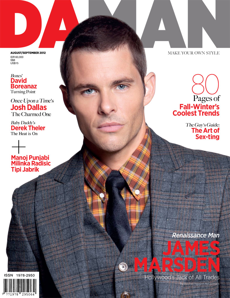

The above colour schemes and type chosen for the magazines seems to suit well with the imagery in the front cover itself. This is the sort of front cover that I aim to emulate as the colours nicely contrast each other couple with the fact that both magazines basically cover my keywords although the second and third front cover in my opinion aren't as 'edgy' but is minimal, vibrant, colourful and definitely modern
No comments:
Post a Comment