This is the part of the assignment where I make sure the work that I have done and the brief are on the same level. Making sure my work coincides with the brief is extremely important.
Small mistakes can be make and it is best to do all that is possible to prevent them from happening, this for me means making sure that all the work asked for in the brief has their own designated folders and the link to this blog is made available in plain sight.
This part also means checking everything in the eMagazine is operational in terms of the music playing every time the file is loaded and in this case, making sure the last page is set up and ready for the auto slideshow to go into. Hopefully, I am able to get assistance on that issue but if I cant then the contingency I set in place should cover me. One where the images of winter trends are still made available to input manually instead of loading them should the slideshow become an issue.
The only thing that worries me as of now is the testing of the file to make sure it plays fine. In the simulator it works fine but anything can happen and I am and have prepared for the worst.
Sunday, 30 November 2014
Checking the eMagazine & Final Decisions
The last things I need to do would be to have everything ready just in case I run into any last minute problems.
I will be saving duplicates to make sure nothing at all can corrupt my work in any way, I have had issues like this in the past.
I need to make sure that all assets are done and in one folder ready for review.
All the type I have used needs to be suitable for final product.
Colour Scheme needs to be made final.
Images for auto slideshow pre-gathered and ready for installation.
Need a final decision on which screen shot is best for the end product of the eMagazine.
I think I like the last one as it does remind me as if I am looking through a collection of images.
Last Minute Worries
This is just to jot down what I feel like needs more attention.
I feel like the Collaborations page needs something more to give it life as just the images are not going to be enough to keep the user entertained.
Perhaps some text written near it will help give that page some more character. My aim was to make the page look a bit dark and I believe I did so with the use of imagery in both collaborations.
Adding some information to the images gives the page a body in a sense and so I think that is what I will do. I may just give a brief explanation of the companies involved in the collaboration and maybe how much the purchase will run the user when it comes out
eMagazine Progress & issues
I have now sorted out near to all issues related to the eMagazine and am left with only one more issue to solve and that would be the last potential page where there needs to be a slideshow of images to display clothing items that can be worn in the winter to look trendy.
The issue here is that I intended on using a past example which was going well and everything until I decided to replace some of the images with my own and mess up the directory. After this happened, I lost not only control but also hope of what I could do to troubleshoot the slideshow and decided to do everything else around it and wait until the next morning to see someone about the problem at hand and hopefully get it resolved.
This would involve me getting all the information about the hottest winter trends in the form of images and also a really well-rounded 'sneaker rotation' to show what would be best to wear in the cold.
Another minor issue, well, worry, I'm having is the fact that the app needs to be published but I just feel like I have done it wrong. I don't have access to a tablet to test the files on as the tablet I thought I had, has a broken charger and finding one at the loan store wasn't helping as they had none for me to use. This meant that I was working under the assumption that the file, as it is in a tablet form would work properly on a tablet as long as the publishing settings were correct.
Issues Solved!!
Finally, I managed to solve the everlasting problem I have been having with the eMagazine, the scrolling issue. I decided to mess around with the destination folder that the artefact was kept in and upon doing so found a fluency in the way my magazine scrolled.
All that was left to do now was to make sure that the pages showed up individually and not show up displaying part of the next page.
I edited the numbers of the slidecounter on the lines 65/68 & 78/81. These lines determined I guess how many pixels the slider would slide before stopping. I eventually made it so the pages came up individually to display their own information.
Upon doing all of this I decided to include a song on loop to have a cool, calm and collected vibe throughout the whole eMagazine. This was done to further the users experience and I wanted to allow the user to immerse themselves in the eMagazine as there aren't any interactive 3D videos as I tried to do this but came up empty handed.
Peer Feedback
Bar the issue I have with the sliding gesture I asked some people to have a look at the eMagazine to know what they thought of it in terms of how it looked, first impressions and the vibe it gives off although everything isn't complete yet.
I showed the eMagazine to 3 people.
1st person:
- They didn't know the celebrity on the front cover and so they weren't as "engaged" as they could have been.
- They did like the colours on the pages and thought it magazine looked "well planned out"
- Liked the images used, the overall comments on the magazine were good
2nd person:
- Didn't know about the celebrity but was willing to be invested and read on.
- The pages weren't al that colourful but did just about enough to keep their attention
- The collaborations peaked their interest, they wanted to know more about the trainers (young reader)
- The music was calming, set "a good vibe"
3rd Person:
- Didn't like the colours, thought they were a bit dull and extremely bland
- Did like the use of imagery.
- Wasn't a fan of the music much and felt there should have been a pause button to stop it.
Saturday, 29 November 2014
Progress so far and continuity issues
So far so good, I have managed to get all the pages for the eMagazine done. All that remains is to add some other interactive elements to spice the magazine up. This would just be to keep the user entertained but still but informative.
The only issues I'm having as of now are that I've still not managed to get the eMagazine tested on a tablet as there is an issue with finding its charging port.
The other is that I'm still trying to fix the code for sliding the pages. Other than that, I still believe that one of the pages in the eMagazine needs to be rectified because I would like to make the story more recent and relevant. Also, I want to keep going over the layout of the pages to make sure they look informative and pleasing to the eye even though they may be bland.
I have been lacking on the blogging aspect of things as I was behind but that's over now. I aim to have finished and fixed the problems I have with the action script class by today, if not then I will need some more assistance but hopefully it doesn't come to that.
Feedback
This information was saved in my notes.
'Today, I saw my tutor and initially I was quite worried as the day before my tutorial the work I had been doing on my eMagazine wouldn't doing it was meant to be, which was sliding and without this feature I wouldn't really have much to show my tutor except from the magazine's front cover. I had been made more nervous when I saw that others had much more work done than I did as I had been stuck on the fact that the pages would not slide at all.
Luckily, my tutor reassured me that the work I had done was fine at the time as at the very least he had seen the code I did was present. My worry was not only on the amount of work I had done but the doubt that I had in my issue being fixed, I thought that my issue was a coding error but in fact it was just the way I had my folders set up as using "/" was causing an issue with an swf file not loading or being published. This problem was quickly sorted but I still had the issue of the pages not sliding properly and the stage size not being able to accommodate 5 '1024 x 768 px' squares next to each other horizontally.
My tutor mentioned that fact that instead, I could use a placeholder and just replace child so that the pages load underneath each other. I still decide to stick with my original idea as I do not want to introduce something new only to be lost or to have other issues go wrong with the project than I already do. I was however told that this could just be the simulator's fault and that the sliding feature may well just work anyway but when tested on the platform itself. I was told to change the target to 'AIR for android' instead of 'AIR for iOS' because it is easier to test.'
Researching to bring keywords to life in eMagazine- Type
I am always looking for different ways in which I can improve the presentation and cleanliness of information on different platforms whether it be video or print and in this case e-media.
I aim to find some clean type that would not only stand out but look professional. I found a few that I think looked good. I do have to admit that some of the font look too thin too stand out but I chose them because I really liked their simplicity.
The font that stood out the most as well as its type would have to be PARAGON as it is thicker than the rest and isn't too professional but looks quite relaxed in a sense, not too sophisticated.
Below are all the fonts that were reviewed and tested against my front cover's colour scheme and PARAGON stood out the most:
Initial work in progress
I opened Flash with the assumption that an iPad setting would be available already but upon doing so I noticed that the setting was not there. I then searched the dimensions for the most commonly used iPad which was the iPad 2. I needed this for my stage size and although it took some time to find, I eventually had a setting of 1024px x 768px stage size.
I found a tutorial that showed me how to make a sliding feature for an iPad. I also read over the code that would be needed to make the sliding feature work but prior to this I had issues with what to search when making/creating a sliding feature in Flash.
I had finally found what to search and upon doing so actually noticed an already published example in Flash, called 'Sliding Example'. I knew that was what I wanted to create and found the code needed to make it so I began reading over the code to understand the functions written to make the pages move and how they're identified.
I implemented the code from the example into what I wanted to do as it had the same concept and decided to start working on the sort of type I wanted to use for the magazine's cover line and normal text. Upon reading the brief I read that you can either have a logo or styled title and since I am in the making of a eMagazine I decided on a styled title. The title being 'OFF SIGHT'.
OFF SIGHT
In terms of the word "OFF SIGHT" and what I believe it means for the eMagazine I think that it is spun in this instance to mean something that is off tone, out of touch, in its own dimension almost and besides the obvious deliberate connotation of the individual words themselves - 'not being seen' or 'beyond even the peripheral of our sight'. I like to think of the word as something innovative because it has an obvious connotation to it but looking deeper, it is much more harder to explain or even to delve into because I believe there is more to this than meets the eye (pun intended). The meaning of this word is more abstract than it seems to be upon looking at it for the first time. The title itself when seen is a bit off and its abstract look among other things gives it its name.
Making the pages came easy at first as with my research on colour scheme I managed to join some to make the front cover's background quite quickly and from the examples of magazine's I had seen coupled with the fact that I am intent on making the eMagazine with the keywords in mind, I decided to use clean and neutral backgrounds to build the eMagazine.
Researching to bring keywords to life in eMagazine - images
After my confidence in the research I found, about colour palettes and using various colour schemes to create unique custom colour schemes I decided to look into examples of different magazine which emulated the sort of design aspect I aimed to display with my keywords in mind. The theme of the eMagazine is to be mainly a fashion magazine with music influence included in its elements.
This meant that looking at not only magazines that blurred the two lines but also the celebrities that incorporate this aspect in their careers.
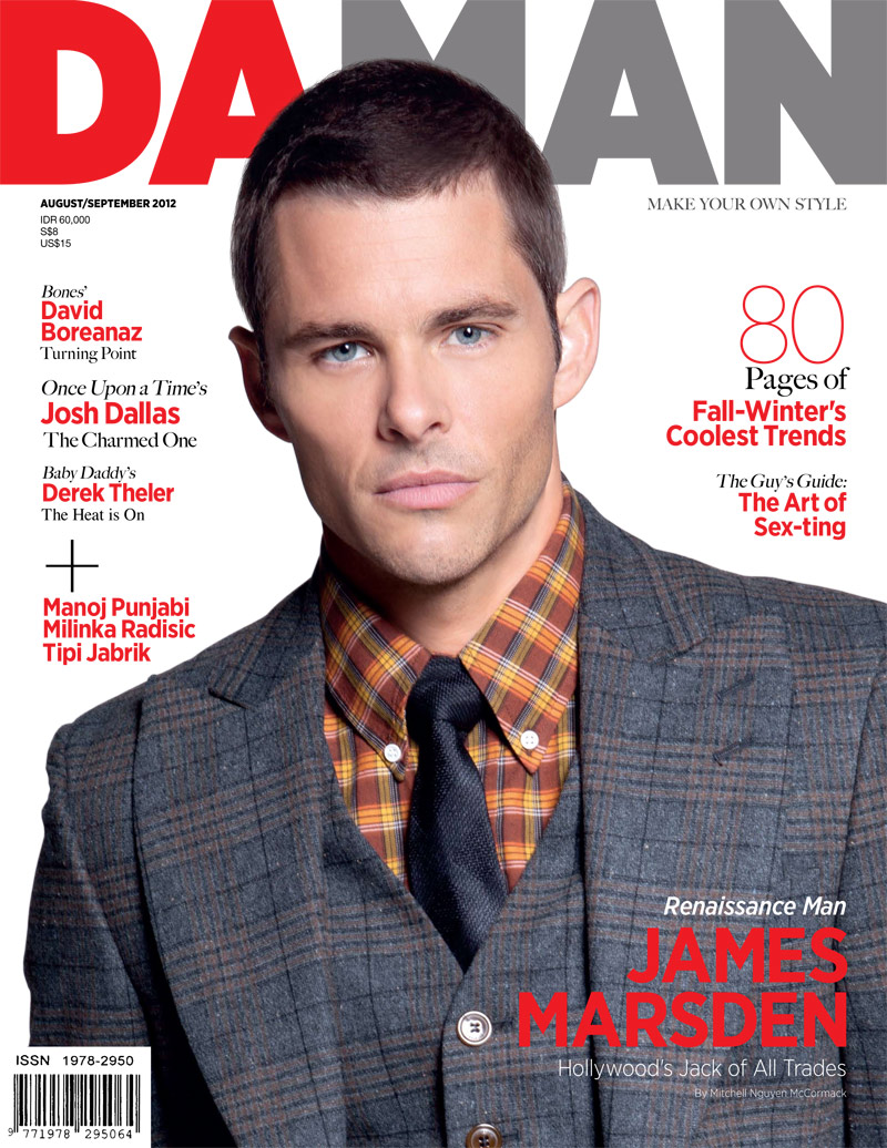
Existing Magazines I looked at that stood out to me in terms of how standoffish they looked and how minimal but effective with type, colour and also the images they included were : Fader Magazine, Daman, GQ, Complex (some) and Vibe magazine.
I also found an analysis of magazine front cover to help guideline the common do's and dont's of making the front cover of a magazine in the category of my choosing. The image below outlines the brief terminology of a magazine's layout in terms of where things should be as well as the appropriate information to include in the designated sections.
 The most important points I noted where parts like the style, celebrity of choice, the headline and an additional cover line.
For me, the celebrity of choice almost depicts the magazine cover's character, it would be wise for me to use a 'cool' celebrity in order to get a relaxed vibe from the eMagazine.
1.
2.
The above colour schemes and type chosen for the magazines seems to suit well with the imagery in the front cover itself. This is the sort of front cover that I aim to emulate as the colours nicely contrast each other couple with the fact that both magazines basically cover my keywords although the second and third front cover in my opinion aren't as 'edgy' but is minimal, vibrant, colourful and definitely modern
This meant that looking at not only magazines that blurred the two lines but also the celebrities that incorporate this aspect in their careers.
Existing Magazines I looked at that stood out to me in terms of how standoffish they looked and how minimal but effective with type, colour and also the images they included were : Fader Magazine, Daman, GQ, Complex (some) and Vibe magazine.
I also found an analysis of magazine front cover to help guideline the common do's and dont's of making the front cover of a magazine in the category of my choosing. The image below outlines the brief terminology of a magazine's layout in terms of where things should be as well as the appropriate information to include in the designated sections.
The most important points I noted where parts like the style, celebrity of choice, the headline and an additional cover line.For me, the celebrity of choice almost depicts the magazine cover's character, it would be wise for me to use a 'cool' celebrity in order to get a relaxed vibe from the eMagazine.
1.
2.

The above colour schemes and type chosen for the magazines seems to suit well with the imagery in the front cover itself. This is the sort of front cover that I aim to emulate as the colours nicely contrast each other couple with the fact that both magazines basically cover my keywords although the second and third front cover in my opinion aren't as 'edgy' but is minimal, vibrant, colourful and definitely modern
Thursday, 27 November 2014
Research to bring keywords to life in eMagazine - colours
The keywords I used to describe how the eMagazine should and would look. These words being: Edgy, modern, minimal, colourful and vibrant.
In order to achieve this I believe certain colour tones and patterns need to be displayed. I initially began searching futuristic and minimal colour palettes in order to guide as to how I would proceed to put images and type onto the front cover and the eMagazine's respective pages.
 This is one of the search results that I had found upon looking for a minimal colours I believed would suit my magazine and fulfil the keywords I aimed for in this eMagazine:
Prior to this search I tried to gain influence from already existing magazine covers and even more specific colour schemes, one being custom scheme which involves the different tones, shades and tints within a specific hue.
An example of what the schemes I found are below:
The first colour scheme is a bit darker but at the same time includes elements of light for example, the middle rectangle which features a light beige.

This custom colour scheme features more neutral colours especially towards the end. Personally, I am quite the fan of darker palettes, more so the last 3 colours to the right as they sort of colours I gravitate towards.
In order to achieve this I believe certain colour tones and patterns need to be displayed. I initially began searching futuristic and minimal colour palettes in order to guide as to how I would proceed to put images and type onto the front cover and the eMagazine's respective pages.
This is one of the search results that I had found upon looking for a minimal colours I believed would suit my magazine and fulfil the keywords I aimed for in this eMagazine:Prior to this search I tried to gain influence from already existing magazine covers and even more specific colour schemes, one being custom scheme which involves the different tones, shades and tints within a specific hue.
An example of what the schemes I found are below:
The first colour scheme is a bit darker but at the same time includes elements of light for example, the middle rectangle which features a light beige.
This custom colour scheme features more neutral colours especially towards the end. Personally, I am quite the fan of darker palettes, more so the last 3 colours to the right as they sort of colours I gravitate towards.

This gradient is a more my type but in terms of the client I intend on using lighter colours and using out standing type so that the page really pops out at the user. In order for me to address the keywords effectively using this colour scheme, I will need to use dark and neutral but semi-bright colour type to bring vibrance and colour to the page, hopefully the subtle background with its minimal text can bring forth an edgy feel to my magazine. I aim to use this tactic throughout the magazine.
Saturday, 22 November 2014


Posters + logo incomplete issue
Previously to picking the competition, I had made 3 posters for 3 different events and upon doing so a logo needed to be created as part of my portfolio. This was to be shown as a presentation.
M posters were as follows:
1. Adobe Design Achievement Awards


This poster in particular was the one that was out of the 2, the most standoffish as it did not correlate with the others in the slightest. The critique on this poster was focused around the text and the layout technique overall. Above all, my logo was no present which still needs to be done.
3. L.A.S.T event San Jose (updated version - previous version lost)

The critique given to me on this poster was initially that it was too bland, had no logo, lacked information about the exhibition and was no way near coherent a poster as the first one for Adobe was. Also, he made a similar case with the Comm Arts poster that the posters were not similar.
M posters were as follows:
1. Adobe Design Achievement Awards
This poster featured a 3D like style of writing all the way from the "ADAA" logo to the writing underneath which didn't really go down well with my tutor as he mentioned people do not want to be confused when they read a poster but I thought that an image being distorted in a way would grab attention. I told this critique and created something similar but used the same style font and that. The plus on this poster was that my tutor liked the use of white space and the design in the corner but the logo was missing and so mentioned that that was a must to have with all 3 posters which I had forgotten upon making them.
2. Comm ArtsThis poster in particular was the one that was out of the 2, the most standoffish as it did not correlate with the others in the slightest. The critique on this poster was focused around the text and the layout technique overall. Above all, my logo was no present which still needs to be done.
3. L.A.S.T event San Jose (updated version - previous version lost)
The critique given to me on this poster was initially that it was too bland, had no logo, lacked information about the exhibition and was no way near coherent a poster as the first one for Adobe was. Also, he made a similar case with the Comm Arts poster that the posters were not similar.
Concept Decision
I am doing the eMagazine for the Adobe Awards competition.
The eMagazine will be 6 pages with 2 of those pages covering the same story, acting like a double page spread. The overall concept is to blend the world of fashion with the style of music magazines and bring forth a new outlet which blurs the lines of both platforms.
My choice to do an eMagazine was made firm some time ago by my tutor, I have since then been trying to piece together research that should aid me in achieving the eMagazine that I feel would look the most, not only professional, but also edgy and modernistic.
Subscribe to:
Posts (Atom)